Sacalling web experience for Sage software
Lead the experience design of Sage’s European web ecosystem, supporting brand transformarion and conversion optimization acrross multiple markets.
Time: 2021-2024
Role: Main UX designer for EU market

Key deliverables:
Tool used:


CONTEXT
As competition intensified in the B2B market, Sage needed to modernize its digital presence and strengthen its brand differentiation.
With the shift toward online product discovery accelerated by the COVID-19 pandemic, the web became a key acquisition and conversion channel.
However, the existing experience lacked consistency, clear value communication, and scalability, leading to the need for a unified design system and rebranding.

WHY SAGE NEED REBRANDING?
How to build a web experience system that is both unified and flexible, aligns with the brand, and drives conversions in a complex environment involving multiple countries, products, and teams
Market shift to digital-first B2B
The B2B SaaS market became increasingly digital-first, Sage need to strengthen its digital presence to support modern user expectations around clarity and speed
Producr complexity and clarity gaps
An expanding product ecosystem made it harder for users to quickly understand, compare, and evaluate Sage's solutions, increasing the need for clearer structure and messaging.
Shift to direct digital acquisition
Sage transitioned from a partner-led model to a more direct, web-driven acquisition journey, making the website a key touchpoint for conversion and decision making.
Inconsistent brand experience
Fragmented visual language and interaction patterns across pages and markets created inconsistency in how the brand was perceived online.
MAIN CHALLENGES
How to build a web experience system that is both unified and flexible, aligns with the brand, and drives conversions in a complex environment involving multiple countries, products, and teams
Fragmented information architecture
Users struggled to understand product offerings, compare options, and identify the next step.
Inconsistent multi-market experience
Visual design, interaction patterns, and tone of voice varied across markets, weakening brand consistency.
Unclear product value communication
Product pages did not clearly highlight selling points, benefits, or reasons to choose Sage.
Friction in the E-commerce journey
The path from product discovery to trial, purchase, or sales contact lacked clarity and efficiency.
MY ROLE AND SCOPE
A cross-functional UX role focused on brand consistency, product communication, conversion optimization, and European localization
Brand to product communication
translated the new brand identity into clear product storytelling
Conversion focused journeys
optimized key journeys from discovery to trial and purchase
Data-informed experimentation
used analytics and A/B testing to validate decisions
Cross-functional alignment
worked with marketing, content, PMM, SEO, and product teams
Continuous experience improvement
improved experiences through research, feedback, and behavioral data
European market localization
adapted experiences across markets, languages, and local expectations
MY FOCUS AREAS
My work consists of four distinct areas, all of which aim to build a robust user experience—transforming fragmented pages into a scalable, conversion-driven web experience system


01. Web experience system
Created a scalable web experience system by translating Sage’s rebranding into consistent layouts, components, interaction patterns, and mobile-first responsive principles across European markets.
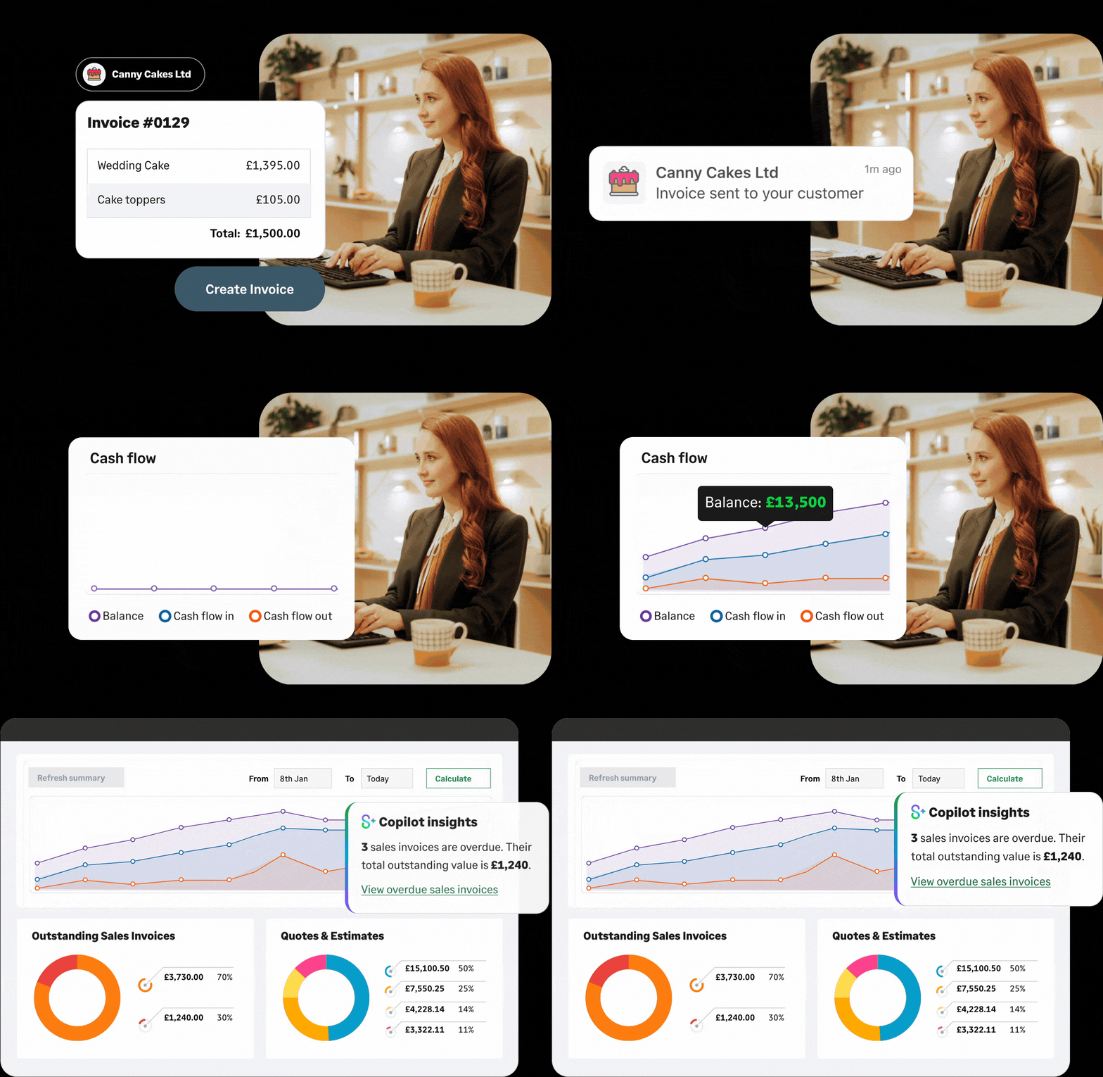

MAIN WORK FLOW
A collaborative and data-informed workflow used to align brand, user needs, and business goals across Sage’s European web experience

I was involved in the UX work for these countries
IDENTIFYING EXPERIENCE GAPS
Before redesigning the web experience, we audited key pages to uncover issues in information structure, product communication, and conversion clarity

OLD FRENCH HOMEPAGE
The previous homepage felt visually fragmented and lacked a clear information hierarchy, making it harder for users to understand Sage’s value and take the next step.

OLD FRENCH PRODUCT PAGE
The previous product page lacked visual engagement and clear structure, making it difficult for users to quickly understand the product’s value and benefits.

Key Issues in previous website
These issues can hinder the user experience and impede a company’s digital transformation efforts
Visual Inconsistency
The use of cartoon imagery and visual elements felt disconnected from the overall brand direction, creating a fragmented and less coherent first impression

Low Decision-making Clarity
Users were not guided effectively toward key actions, such as exploring products, understanding value, or starting a conversion journey.

Confusing e-commerce journey
The unclear e-commerce journey created friction around pricing and purchase decisions, leaving users unsure how to buy and what price applied.

DEEP DIVE SHOWCASE
Next, I will provide a detailed introduction of my design process, methods, and approach.
01-Strategic Alignment Through the Funnel
To align design with business goals, we structured the web experience around the customer funnel — from awareness to consideration and conversion.
This helped us define the role of each page, prioritize content, and make design decisions based on user intent at different stages.
Top funnel - Awareness
Goal: Build brand awareness and trust
User intent: Understand the problem and disvover Sage
Design focus: Brand story telling, SEO content, educiational pages, visual consistency
Mid funnel - Consideration
Une solution de gestion comptable et financière pour les PME, qui peut être utilisée de manière autonome ou s’intégrer
Bot funnel - Conversion
Une solution de gestion comptable et financière pour les PME, qui peut être utilisée de manière autonome ou s’intégrer
We used the funnel framework to define the role of each page and translate business goals into design decisions.
The funnel helped us move from a page-based design approach to an intent-based experience strategy.
FOR TOP-FUNNEL
Increase users’ interest
Build trust and create a clear first impression, Create strong brand storytelling, consistent visuals, simple navigation, educational content
FOR MID-FUNNEL
Present value proposition
Share the amazing things customers are saying about your business. Double click, or click Edit Text to make it yours.
FOR BOT-FUNNEL
Reduce conversion frictions
Share the amazing things customers are saying about your business. Double click, or click Edit Text to make it yours.
02-Optimizing the Experience for Clarity and Conversion
Based on the funnel strategy, we optimized key pages by aligning information structure, visual hierarchy, and conversion actions with user intent at each stage of the journey.
Information Architecture Optimization
I restructured page content to improve scanability, clarify product value, and guide users toward the next step more effectively.


Conversion Path Optimization
Clarified CTAs, pricing, and purchase journeys to reduce friction, to ensure that users can finish online purchase without any problem.
DEFINE CLEARER PRODUCT POSITIONING
Competitive Analysis
Analyzing competitors’ positioning, messaging, and design approach helped us define a more distinctive and user-centered product communication strategy.

Competitor analysis table ( Simplified version)

03-Turning Strategy into a Scalable Web Experience
How brand identity, user insights, and growth goals were translated into visual systems, responsive layouts, and reusable design patterns.

Brand Expression
We applied the refreshed brand identity to create a more consistent and distinctive web presence, ensuring that visual elements supported Sage’s positioning and strengthened user trust.
Design System Application
The design system helped standardize layouts, components, typography, spacing, and interaction patterns, enabling faster and more consistent execution across markets.


Mobile-first Responsive Design
Sign up to Sage for Accountants to access 4 hours of on-demand masterclasses that help you build a practice success plan. Unlock accreditations for each course and use your plan to meet your goals – from winning new clients and engaging existing ones to meeting MTD for ITSA.
Conversion-oriented UI Patterns
UI patterns were designed to support conversion by making key actions visible, reducing uncertainty, and reinforcing user confidence at decision points.

DESIGN SHOWCASE
Translating strategy into clearer, scalable, and conversion-focused web experiences
Homepage redesign
Homepage was redeigned to create a stronger first impression, improve information hierarchy, and guide users more clearly toward product exploration

Visual alignement
Based on the latest design system, using consistent design elements to ensure a consistent visual style across countires.
Product Recommendation
This section is used to share the latest news about Sage, including corporate-sponsored events and other activities.
Event Notice Board
Categorise products by company size to make it easier for users to find the right product for the.
Customer testimonials
Sharing client testimonials is a good way for organizations to establish credibility and trust with their consumers.
Useful resources
By showcasing Sage’s resources and services, we make it easier for users to learn about the company and its products
Product pages redesign
The product pages were optimized to help users quickly understand the product value, compare benefits, and move confidently toward trial, purchase or sales contact.
Product value communication
As the first part that users see when they land on the page, the hero banner explains the product’s purpose and value, enabling users to quickly understand the product and sparking their interest
Key functionalities introduction
Through clear descriptions and high-quality UIs, users can quickly grasp the product’s appearance and core features.
Product card
By surfacing key benefits and product categories, product cards reduce cognitive load and support faster decision-making.
Free trial and promotion
Free trial and promotion can drive more conversions by offering users the opportunity to try the product and contribute to the conversion rate.
Add-on and extensions
Free trial and promotion can drive more conversions by offering users the opportunity to try the product and contribute to the conversion rate.
FAQ
FAQ help us engage with the target audience, answer relevant questions that potential customers might have

E-Commerce journey redesign
The e-commerce journey was refined to reduce uncertainty around pricing and purchase paths, helping users make decisions with more confidence.

Product Descriptions and Conversions
Include video introductions, feature lists, and clear pricing in e-commerce product listings to reduce barriers to purchase for users.

Payment Process
A clear purchasing process lets users know why they are paying and what information they need to provide during checkout, ensuring that every step is straightforward and easy to follow.

User E-commerce Experience Flow
Mobile-first design
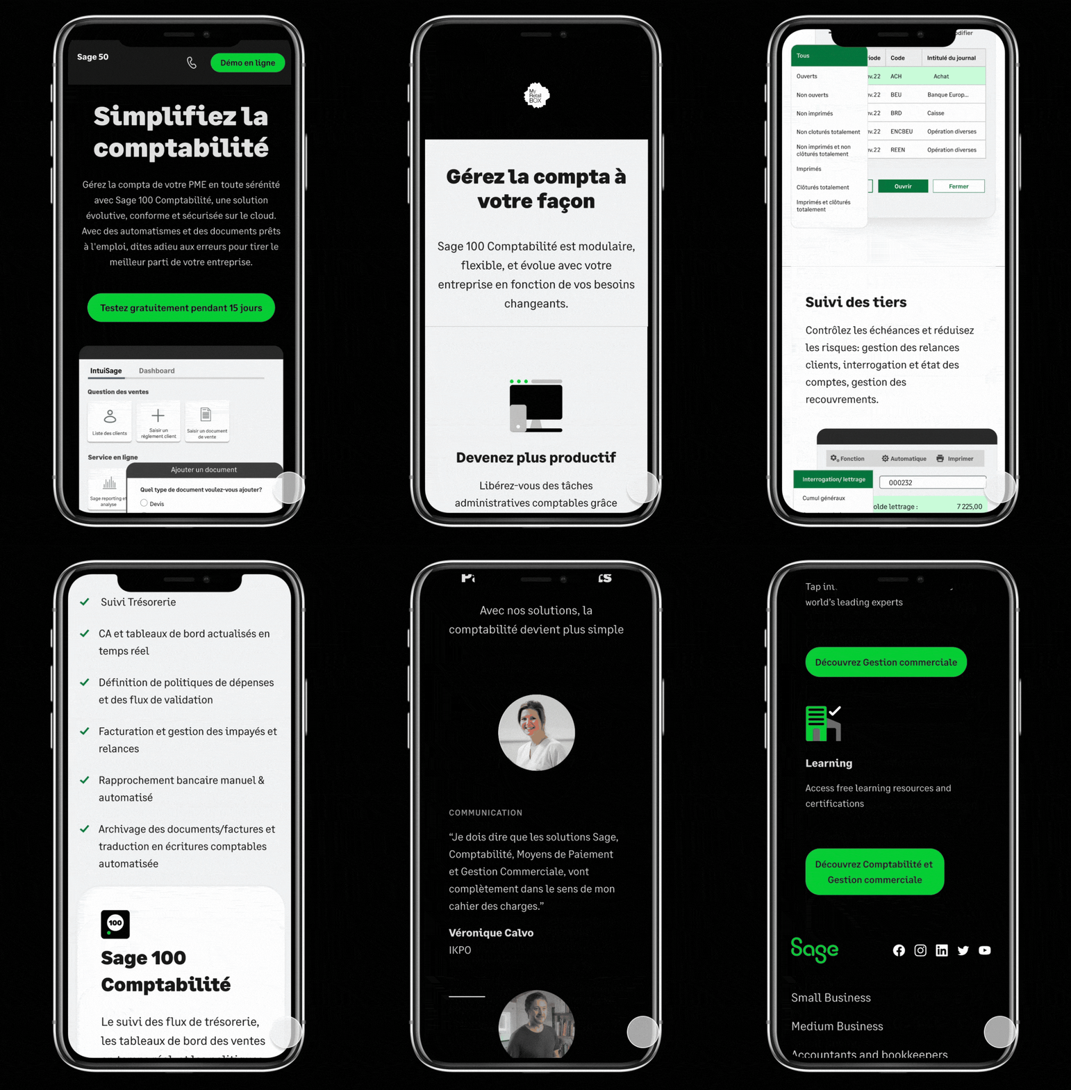
Mobile-first design is crucial because most people access the Internet on their phones now. Focusing on the smallest screen first lets us keep our design clean, clear, and user-friendly for most mobile users
Adaptive UI
As product UI are the key for users to learn about a product, we have designed the dedicated mobile version to ensure the best presentation.
Responsibility
All components in our system are responsive, so they automatically adjust their size according to the screen size, ensuring a consistent user experience across all devices.
accessibility for mobile
Accessibility was integrated into the design process from the beginning, helping create a clearer, more usable experience for all users — especially on mobile.

FROM INSIGHT TO ITERATION
Using analytics, A/B testing, and user feedback to validate design decisions and continuously improve the sage web experience

The UX improvement process
At Sage, our UX team follows strict processes to drive user experience optimisation, ensuring that designs are successfully translated into business growth.
1.Behavioral analytics
To keep iterating the design and experience, we used Google Analytics and Contentsquare to understand how users navigated key pages, where they clicked, how far they scrolled, and where friction appeared in the journey.

Page analytics
At this step, we need to understand how users interacted with the pages, we need to check:
-
Page traffic/ visit
-
Click-through rate
-
Drop-off points
-
Conversion paths
-
Heatmap/ session behavior


2.A/B Testing
When design direction was uncertain, we used A/B testing to compare alternatives and identify which version better supported user engagement and conversion.
A Version ( static UI hero)

B Version ( animated UI hero)


Test analysis
When design direction was uncertain, we used A/B testing to compare alternatives and identify which version better supported user engagement and conversion.

3.User feedback and Research
User feedback and research helped us understand the "why" behind behavioral data, especially around product comprehension, pricing clarity, and purchase confidence.

Understand users from multi-chanels
This multi-source research approach ensured that design decisions were not based on isolated signals, but on a balanced understanding of user behavior, business priorities, and real-world feedback.
OUTCOME AND IMPACT
The redesign of Sage's European web experience led to a more structured, consistent, and conversion-oriented platform. By aligning brand, UX, content, and data, we improved how users understood the product and how they navigated key decision-making journeys.

From experience design to business impact
Measurable improvements in clarity, consistency, and user journey effectiveness.
User impact
Improved clarity and understanding of product value, helping users navigate key information more efficiently across the experience.
Result: +25% user satisfaction rate
Business impact
A more structured funnel and clearer product communication supported stronger conversion-oriented journey and reduced friction in decision-making.
Result: +7.8% income from website/e-commerce
System impact
A unified design system and mobile-first approach improved consistency across markets and enabled more acalable excution across teams.
Result: +1000 design assets and components created for Sage in 30 countries